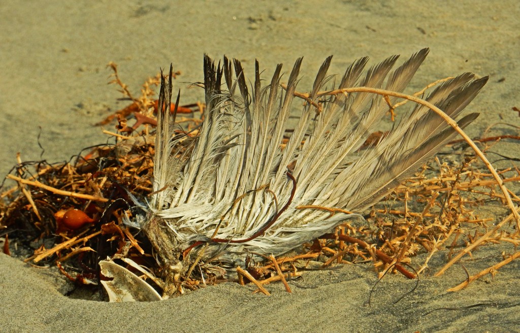
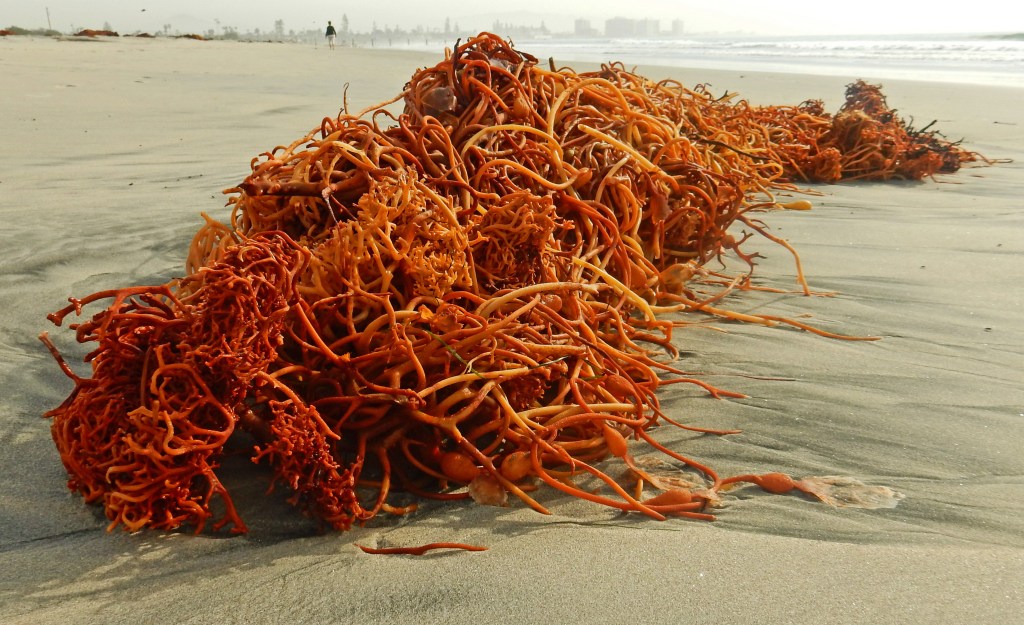
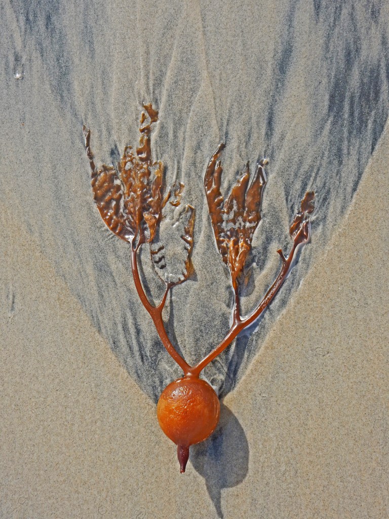
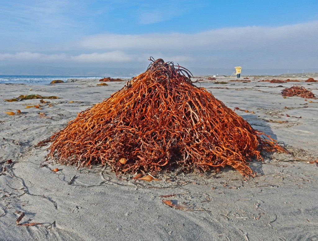
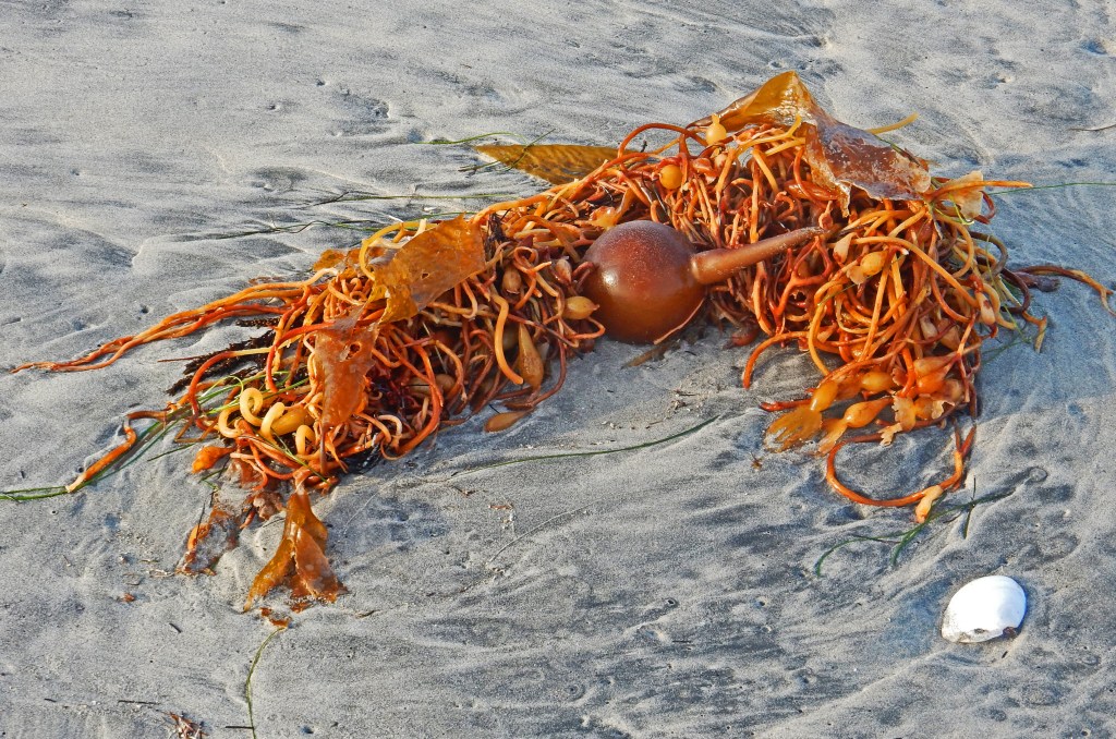
Artist Statement: I try to capture moments of transition, knowing that such moments often occur in stillness.
Digital Photography, North Island (California), December 2015
JIM ROSS jumped into creative pursuits in 2015 after a rewarding career in public health research. With a graduate degree from Howard University, in seven years he’s published nonfiction, fiction, poetry, photography, and hybrid in over 175 journals and anthologies on five continents. Photo publications include Bombay Gin, Burningword, Camas, Columbia Journal, Feral, Friends Journal, Manchester Review, Stonecoast, and Typehouse. Recently-published photo essays include Barren, DASH, Kestrel, Ilanot Review, Litro, New World Writing, Sweet, So It Goes, and Wordpeace, with Typehouse forthcoming. Jim and his wife—parents of two health professionals and grandparents of five little ones—split their time between city and mountains.
How do we apply language and meaning to an aesthetic? Can we be precise? Susan Sontag attempts precision in 58 paragraphs by listing in detail the sensibility of “camp” for those who are unaware. “The essence of camp” she begins, “is the love of the unnatural: of artifice and exaggeration.”
I’d read Sontag’s essay last summer and by the end of it felt I’d need to remember all of it. Highlight number 5 and number 6 oh and number 7, too. Read up on Henry James and Oscar Wilde for good measure. What does Greta Garbo look like again? Oh, I love this word epicene- so precise! Sontag grasped an idea I understood very well but couldn’t explain myself. Camp is better seen and felt. How did Sontag manage to describe taste, style, and convention while simultaneously debunking all three and making it clear and knowable? My answer is research! If you’re thinking this a quick read on some idle Tuesday night, behold, open your google browser and cancel your morning workout.
The 2019 Met Gala gave people who’d never read Sontag’s work or given thought to taste as a sensibility: good and downright awful, nothing in between. On Monday night I feverishly hashtagged metgala and received minute-to-minute updates (yes, this was during finals) of the looks from the evening. On the red carpet, most celebrities shrugged and gritted their teeth when asked of their thoughts on the night’s theme. For me, Kim Kardashian was the complete embodiment of camp as an aesthetic. Kardashian represents a feeling in our country- she doesn’t have any extraordinary talents in the entertainment industry, but she has a famous lineage which has made her popular. Popularity is an aesthetic in the United States. Her choice to work with Thierry Mugler of House of Mugler was a smart choice- Kardashian clearly understood the aesthetic because she is aesthetic. Inspired by Sophia Loren drenched in water in the film Boy On A Dolphin, Kardashian arrived dripped in wet in diamond with a tan that matched her dress. She was a walking photograph- a walking sensibility- Kim Kardashian wearing Mugler was “camp.”
The exhibition takes you from 17th-century fashion to modern day. If only Sontag were alive today I wonder if she would add or cross-off anything to her precise list of “camp” and it’s imprecision. One line I keep with me because it’s easy to remember: “the ultimate camp statement: it’s good because it’s awful…Of course, one can’t always say that.”
Notes by Devanshi Khetarpal
It was my last day in New York before I went home for the summer. I wondered if I had the time, in between packing or resting and going to my favorite diner, to go to the Met and visit the exhibit on “Camp,” the theme for this year’s Met Gala. I wasn’t sure if fashion, or couture, specifically, is something I understand, something I “get.” Thankfully, “Notes on Camp” by Susan Sontag was #trending, and inevitably came to my attention the day after the Met Gala. I read it thoroughly, and enjoyed every bit of it just as I have always enjoyed Sontag’s writing, and thought that maybe this time, after I visit an exhibit on Islamic and Pahari art that interested me, I might as well go to the gallery and have a look at dresses, jewelry, whatever they may have there. I had no idea what to expect, what the displays would be like. Should I be using “Camp” as an adjective at all? Is it one? These are just some of the questions that passed my mind.
I finally made the decision to go to the exhibit and thought I’d just skim through everything I needed to see in order to understand. I didn’t have too many questions, I didn’t want too many answers. But as soon as I saw the pink wall (…“is this millennial pink?” I asked myself) with “CAMP” written on it, I was taken aback by surprise because the first thing I noticed was the abundance of text. Old books and manuscripts were kept open behind the glass, sometimes next to shoes or dresses or miniature sculptures that looked like paperweights, the kind no one uses now. As I kept making my way through the exhibit, I saw familiar names: William Shakespeare, Oscar Wilde, Christopher Isherwood, Susan Sontag, among others. I saw brand names, too, of course: Gucci, Louis Vutton, fashion houses I have not heard of and whose names I cannot pronounce but whose clothes, I am certain, are beyond what I can ever imagine affording. I realise that fashion is everything I love and loathe, perhaps like writing in some ways.
But the textuality of the exhibit was unexpected. I didn’t expect to see the world of fashion, the fashion industry, take such an initiative to reflect on its language, the history of its language and to use it as a method to innovate, create, critique, expand. I have been obsessed with the sartorial choices of my favorite writers. I think of Tishani Doshi in Georgia Hardinge’s “sculptural dresses,” I often think of Arundhati Roy draping a saree with her deliciously curly, short hair. I have always wanted to steal their wardrobes; when I was growing up, I wanted to dress up as a writer, like the people I have seen at literary festivals across the country: unapologetically Indian, apparently comfortable, truly colorful and invariably and individually stylish. I had no clue how they did it and through the years, I have been trying to develop my own “sensibility” rather than style. I put myself together deliberately, slowly, cautiously before any poetry reading or public lecture. And even though I am not too well acquainted with the artifice, extravagance and how they must be effectively constructed, or amalgamated into one’s identity, donned as one’s outfit, I do know that camp is a different kind of textuality and intertextuality, one that’s atmospheric too.
I realized this as I walked through the exhibit: the text was pasted onto the glass and the specimens were behind the text. The text became the foreground and retained its textuality, while the specimens became not just evidence of the text but also became the subtext, the background, even in the event of the text merely describing the specimen. This three-dimensional presentation is something intriguing. Was I supposed to treat the text as something that brings out the real of the specimen? Am I supposed to treat the text rather than the specimen as the interface of the textual and the embodied, the real, the exhibited? Or am I supposed to treat the text as hyper-real, something with the capability to break free from the specimen and emerge embodied? I might never know. But while I saw Sontag’s notes on Camp (note the capital ‘C’), I recalled the phrases I had been seeing: “akimbo pose,” “queer attitudes,” “camp it up.” Every piece certainly was different but what appealed to me most was the necessity of the text. The text, the writer of the text was on top of the whole and Sontag’s text appeared atop the semicircle of glass displays, each letter being typed away, fading into each other as the line extended with the soft sound of a typewriter emerging. That, for me, was camp: the crowd, the abundance of text, the many glass displays, the specimens, the color, the sound, the bright light shining on each one, making them stars in the show.
To plan your visit or find out more about the ongoing exhibition at the Metropolitan Museum of Art in New York, visit their website by clicking here.
MARIA PRUDENTE has written about feminist ethics for Manifest-Station and is featured in Grey Wolfe Publishing’s upcoming anthology of nonfiction short stories. Maria is a professional stage and film actress. She received her training from the Lee Strasberg Theatre & Film Institute and graduated from the American Musical & Dramatic Academy with a concentration in Musical Theatre performance. Maria is the Content Editor at CountrySkyline, LLC and proud member of Actor’s Equity Association. She lives in NYC where she studies Creative Writing at Columbia University.
DEVANSHI KHETARPAL is from Bhopal, India, but currently lives in New York City, where she is a junior at NYU majoring in Comparative Literature with a minor in Creative Writing. Her poetry collection, Small Talk, is coming out soon from Writers Workshop India, Kolkata, and her poems have been published or are forthcoming in Sahitya Akademi’s Indian Literature, Best Indian Poetry 2018, Transom, Aainanagar, Vayavya, TRACK//FOUR etc. among others. She is a recipient of the 2018 David J. Travis Undergraduate Research Fund for research on modern Italy, and has studied abroad at NYU Florence and NYU Paris. She has served as an intern at Poets House, and currently works as an application manager for The Speakeasy Project, a poetry reader for Muzzle Magazine, and as a student office assistant for the NYU Department of Comparative Literature. Khetarpal can speak, read, write and translate from or to Hindi, English and Italian, and will start learning Punjabi soon.
Artist Statement: “We still live in a world where women so often don’t have a voice. Exploring feminine power and energy is integral to all that I create as an artist. I feel that energy and power everywhere in nature, which is one of the reasons why I am drawn to flora and fauna imagery in my work. The feminine is natural and good and we must honor it. We must let it speak. We must give it equal importance in every conversation. We must also recognize that it is multilayered and multifaceted. Perhaps that is why I so often render my visions and thoughts in collages, whether in traditional paper form, photography, or mixed media. I work in layers, just as the female mind and the female experience work in layers. And as I work, I often choose colors and materials that remind me of the multiple aesthetics I grew up knowing as the daughter of a Salvadoran mother and a New Yorker father who was raised in the Washington, D.C. area and traveled the world before settling in Brooklyn.”
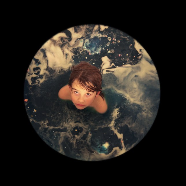
‘Altar and Mermaid No. 10,’ Photography, 2017
‘Altar and Mermaid No. 20,’ Photography, 2017
CHRISTINE STODDARD is a Salvadoran-Scottish-American writer and artist who lives in Brooklyn. Her visuals have appeared in the New York Transit Museum, the Ground Zero Hurricane Katrina Museum, the Poe Museum, and beyond. In 2014, Folio Magazine named her one of the top 20 media visionaries in their 20s for founding the culture magazine, Quail Bell. She also is a Puffin Foundation grantee, Artbridge winner, and Library of Virginia REMIX artist.
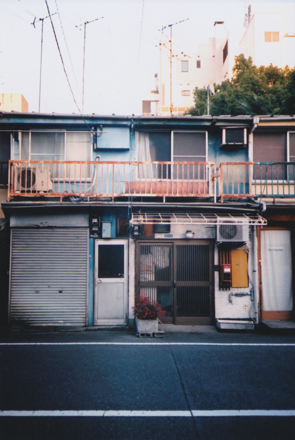
Artist Statement: “These photos are from a series taken in Japan last winter.
It was hard to tell if things rusted more frequently here or if the tone of the rust’s canvas just made it more obvious. The palette of the houses’ paint gave the impression that they had been designed to rust, as if time and oxygen were their final adornments.”
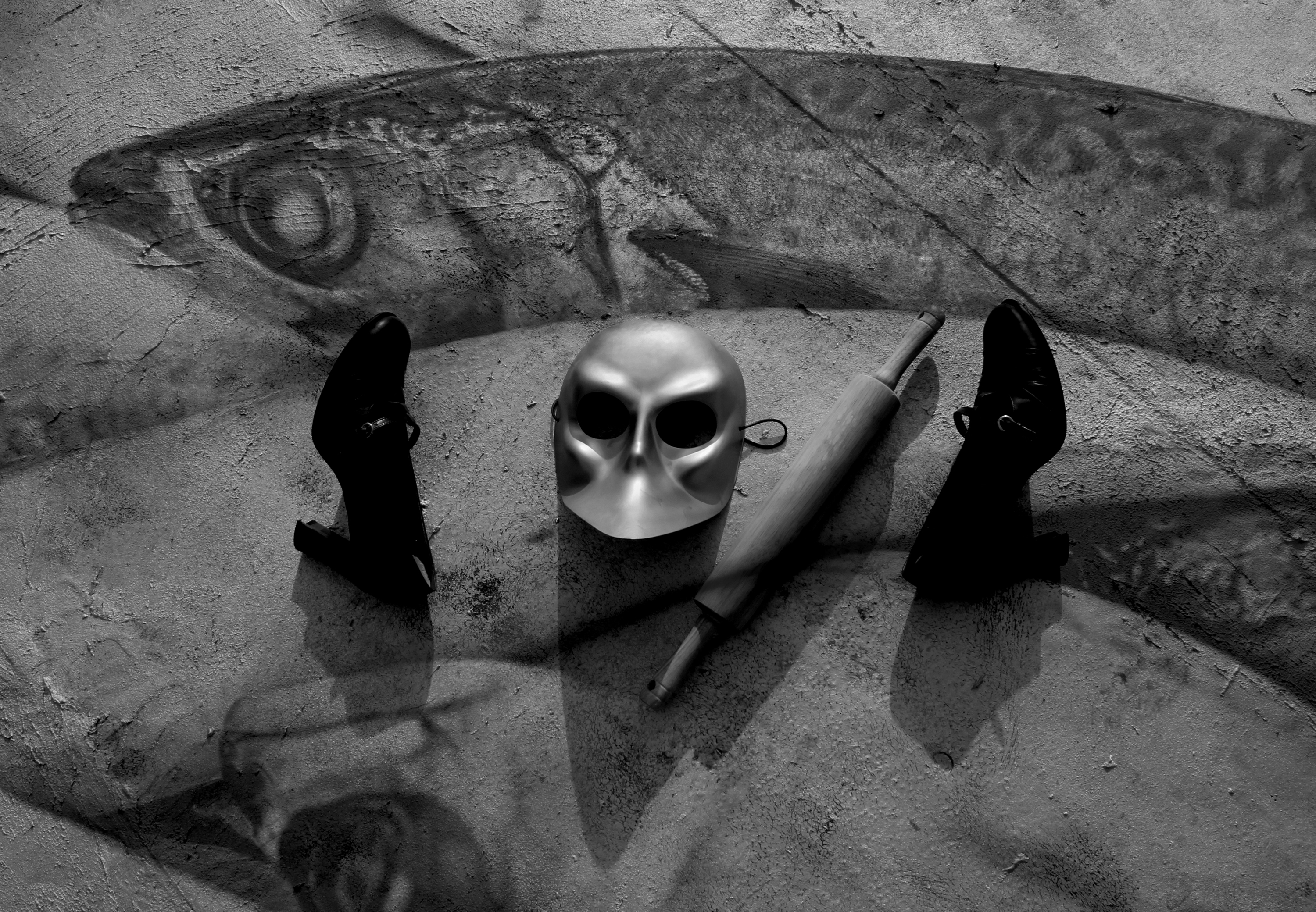
‘Knife Town,’ Photography, 2016
KELCIEis a student living in the northernmost city in the contiguous United States. She has been shooting film for the last ten years.
AVA BORTE is a rising senior at Frank W. Cox High School in Virginia Beach, Virginia and at The Governor’s School For The Arts in Norfolk, Virginia where she has taken classes in figure drawing, art history, screen print, fibers, ceramics, book making, mold making and glass casting, neon, and mixed media. She is a member of the National Honor Society and has accumulated over 500 community service hours since 2015 while leading a team of artists in creating a large scale neon glass installation from her original design. Ava has been recognized for her art by multiple organizations and in juried exhibitions. Ava currently resides in Virginia Beach, Virginia and her in-progress neon installation will be completed, unveiled, and featured in the 2017 GAS conference which will be located in Norfolk, Virginia.
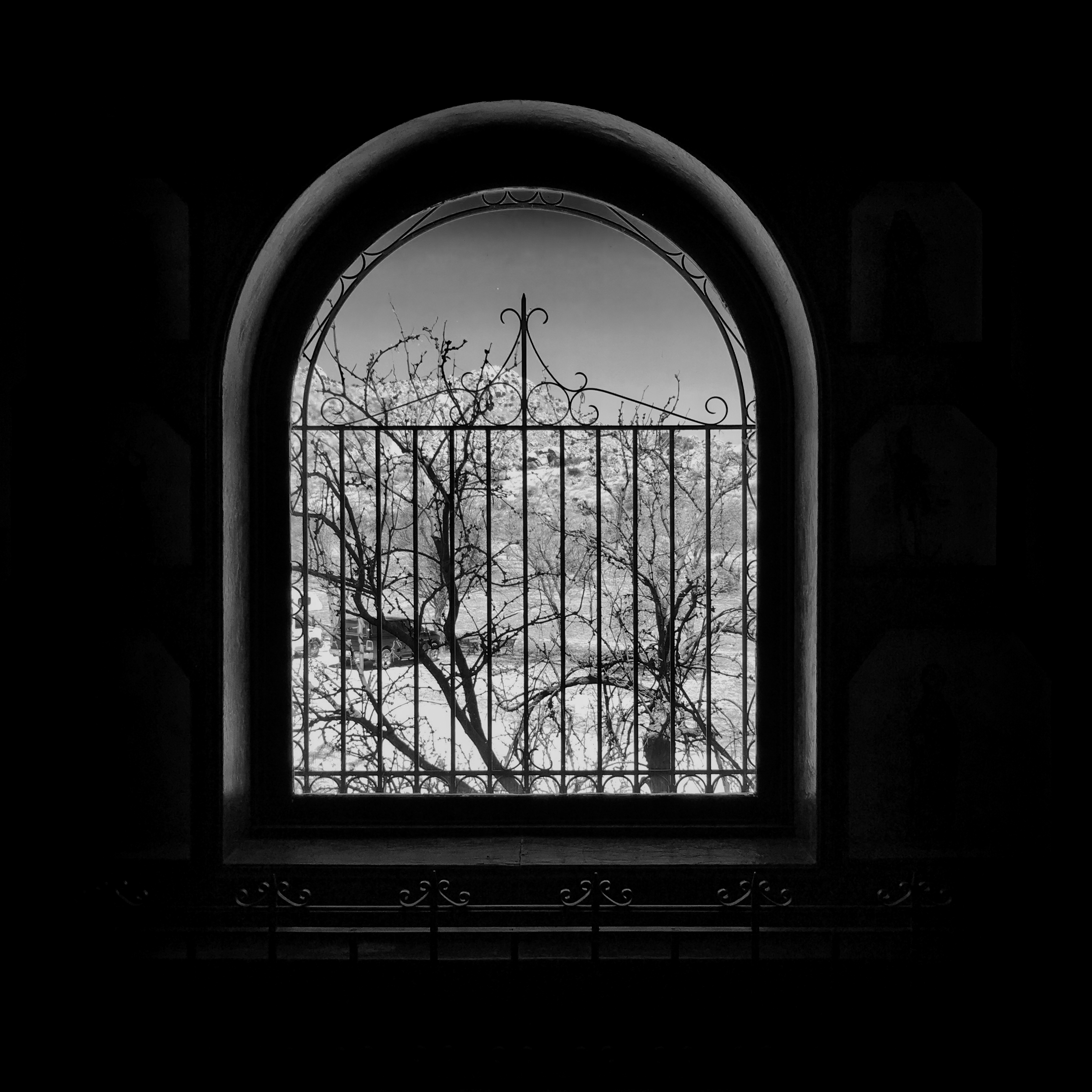
Artist Statement: “Home means many things. To an architect, it is about human scale, budget, and purpose. To a an individual, home is safety, family, personal space. But the setting looms large too, framing one’s view and perspective. Am I looking inward, or outward? Do I want to enter or escape? Is this a home a place from which to launch myself each day anew, or is it a repository of my past?”
‘Ranch Window,’ Photography, 2017
JOHN MARK JENNINGS is a contemporary landscape and architectural photographer based in Far West Texas. His images focus primarily on the American West and Latin America, with an emphasis on sites where the land and history intersect in dramatic ways. John has studied at the Santa Fe Photographic Workshops, Arizona Highways Photography Workshops, Laney College, and with individual photographers throughout the west. He has exhibited during the East Austin Studio Tour and other venues in Austin, as well as online. John splits his time between homes in Marfa and Austin, Texas.
BRAD has shown his drawings, photographs, mixed media and paintings since 1997, in the Portland and Lake Oswego, Oregon area. His art and photographs have made it onto the front covers ofVine Leaves 2014 Anthology and N Magazine, and in Gravel Magazine, Cargo Literary, Jokes Literary, The Tishman Review, Shuf Poetry, Meat for Tea, Mud Season Review, Third Wednesday, Foliate Oak and many other literary publications.

 MARIA PRUDENTE has written about feminist ethics for Manifest-Station and is featured in Grey Wolfe Publishing’s upcoming anthology of nonfiction short stories. Maria is a professional stage and film actress. She received her training from the Lee Strasberg Theatre & Film Institute and graduated from the American Musical & Dramatic Academy with a concentration in Musical Theatre performance. Maria is the Content Editor at CountrySkyline, LLC and proud member of Actor’s Equity Association. She lives in NYC where she studies Creative Writing at Columbia University.