Looking To The Light

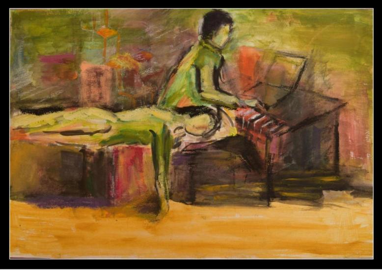
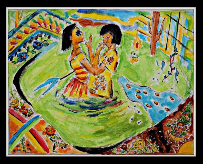
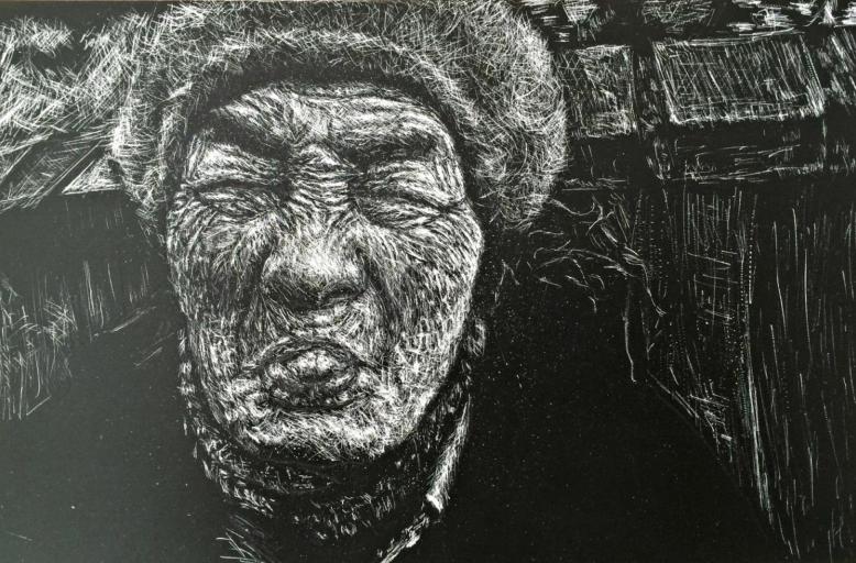
Artist Statement: “This image is part of Robert G Alexander‘s current series, consisting of close-up studies of eyes. This series was initially inspired by his research on visual cognition and psychophysics. Knowing that when we look at other people, we mostly look at their eyes, he wondered if he could transform that typical view in a meaningful way. By taking our most commonly seen features—our eyes—and approaching that subject with awe and reverence, Alexander works to find new meaning, new depths, and new emotions in each drawing. Alexander lives, works, and creates in New York, where his daughters are a source of inexhaustible inspiration and meaning in his life. He works mostly in graphite and charcoal because he feels that the immediacy and freedom in those materials allows him to best capture the sense of empowerment that he hopes to convey in his art.”


2016.04.07_-_Looking_to_the_light_-_original_drawing_by_rgalexandervision_-_reference_eyeball_stock_2_%5b40%5d.jpg

‘Looking To The Light,’ Graphite on Paper, 2016


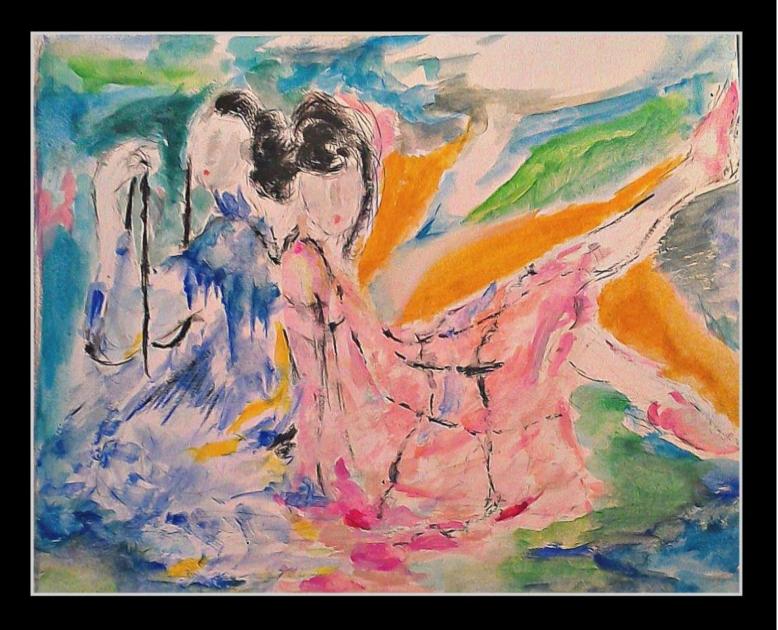
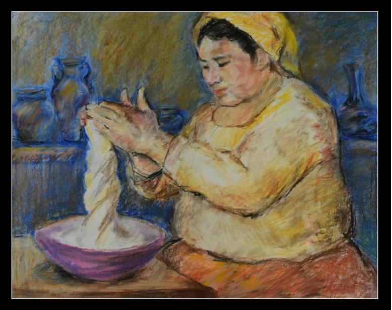
“Many of us struggle with our self-image. Every day, society bombards us with harmful messages. I believe that I have a special responsibility to challenge those ideas, using creative, loving compassion to celebrate feminine grace and strength. I fight back as a visual artist by honoring the positive aspects of body image and by working to break down our emphasis on physical beauty. Everyone deserves to feel beautiful and strong. Our bodies are sacred; our only means to act in this world; to share love and joy. This perspective has led me to engage in dialogue with communities of women who dislike the way they look—including many who have (or are recovering from) eating disorders. Through portraying the strength in these women, and portraying their successes, I advocate for social change: More than ever, we need to recognize our strengths and celebrate the beauty that exists in each other.”—- ROBERT ALEXANDER

Touch is the sense that makes us human

Artist Statement: “A fundamental part of our daily experiences, the sense of touch is a means of gathering information and establishing trust and bonds with other people and environments. In our current society, however, we are “connected” through so many digital channels that our physical connections are becoming lost. 

These magnetic body sculptures turn the unseeable sense of touch into a magnified motion; enhancing the sense. The material construction of the knitted sculptures allows wearers to physically connect themselves to other people and environments around them through the integration of magnetic materials. Utilising the properties of the magnetic knitted structures, these garments can also change shape and form on the body, depending on how they are connected.”


DSC_0330.jpg

‘Touch is the sense that makes us human,’ Mixed Media, 2016


SOPHIE HORROCKS is a British knitted textile designer currently living and working in Hong Kong. Sophie is a keen experimenter who uses materials, structure, and form to explore and understand the immaterial elements of our bodies and environments. As a curious designer, Sophie believes there are no boundaries to what we can classify as a textile, drawing inspiration from all aspects of life; in particular sociological theories, nature and the human anatomy. Previous collaborations have included biomaterial engineers and computer scientists; these have aided her quest to investigate the potentials of materials.

Two Poems


steve k

Illustration by Rebecca Pyle

Our House 

The way to our house takes you past the river
where it bends around Beaver Island, flowing
toward the dam. In June, boys toss
their lines with calm restraint. Their eyes
have become clouds, faces serene as statues
from a land of sun-bleached stone.
They wave as you pass, three hands or four,
and maybe the wind ruffles their hair,
and somewhere strange fish rise toward
the surface with their ancient gills
and their blood. And the road leads down
into a valley of golden trees, where sky changes
color beneath the scarlet sun. You may hear
women singing in the flower-sprinkled grass,
or you may feel the breath of their tongues
as words roll across the yard. There is a word
for anger, and one for spite, and quite another
to describe the hot scent of bread, or the way
to connect two bodies with a little bridge of flesh.


Abandoned North House--Rebecca Pyle--I.jpeg

Illustration by Rebecca Pyle

The House No One Remembers

Here in the north it sits abandoned,

hunched in the wind, a silent place


with a hundred mouths and broken

tongues. Seven hothouse lilies stood


in a clear glass vase, seven cats curled

gray bodies around the hearth, as smoke


braided above the chimney, while cold

sun stared down on juniper and pine.


A sister lived there with seven brothers

who flew into the sky as their black


wings dripped blood onto new fallen

snow. Seven years without laughter


or a single word to disturb the silence

she has come to love, or the rhythm


of her hands weaving brightly colored

tapestries of change. Clean floors, clean


linens, bread and cheese, a table rubbed

with lemon and oil. Water drawn from a


clear well. No boots thumping, no snores

or snapping towels, no coarse hairs


in the sink, just her visions growing like a slow

flame, consuming her day by day without pain.


STEVE KLEPETAR’s work has appeared widely and has received several nominations for Best of the Net and the Pushcart Prize, including four in 2016. His most recent collections are Family Reunion, A Landscape in Hell, and How Fascism Comes to America.

REBECCA PYLE, now living above a hundred-foot rock garden near the Great Salt Lake in Utah, has artwork that will appear or is forthcoming in Hawai’i Review, New England Review, and the art / lit publication Raven Chronicles, out of Seattle. See a collection of her artwork at rebeccapyleartist.com.  She is also a writer, a member of the writers’ group The King’s English, and recent work by her can be found in The Healing Muse, Stoneboat and (later this year) the Wisconsin Review.

Artwork by Margaret Lu and William Higgins

Presenting artwork by Art and Photography Editors, Margaret Lu and William Higgins.


MARGARET LU

Artist Statement: “My art seeks to make the world soften around the edges- to become a liquid mirror onto which lights and colors bleed. The world becomes softly blurred, melting me right into it. It’s those sweet-sharp tidbits, the overlooked mirage of moments past. That is what exhilarates me the most: being enthralled by new ideas, being intoxicated by the romance of the unknown.”

Inklette (1).1-page-001.jpg

“Lackadaisical Euphoria”

Inklette (1).2-page-001.jpg

“Amazon Blues”

Inklette (1).3-page-001 (1).jpg

“Eclectic Ennui”

Inklette (1).3-page-001.jpg

“Whimsical Bliss”

Inklette (1).4-page-001.jpg

“Our Daily Bread”


William Higgins 

Artist Statement: “Three of these photos were taken in Los Angeles. The other two were taken in New York.

I’m mainly influenced by pop art and nature photography. These two blend better in LA than they do in New York. Comic book colors are everywhere all the time. The Southwestern U.S. sky is one of the sharpest blues there is. And then the city has this uneasy relationship with nature. It’s shocking to see skyscrapers against blurred mountains everyday. Suburbs bump up against parks and forests, both state and national. A combination of pop and nature fits the city.

            I also feel like focusing on smaller details in LA. The city doesn’t seem to fit together with itself the same way New York does. There’s a depth and unity in Manhattan’s cityscape that grounds it as an actual city. Shots have to be layered, you can’t dissect it piece by piece. LA doesn’thave a similar vista — except maybe the Hollywood sign — that unites the city the same way Manhattan does. Put in a bad analogy: New York is like an oil portrait,  LA is like a comic, paneled.”

IMG_0367.JPG

IMG_0393.JPG

IMG_0513ADJ.jpg

IMG_0618ADJ.jpg

IMG_0636ADJ.jpg


Maggie(2).png 
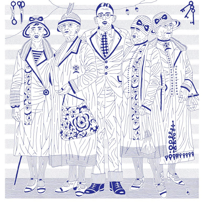
MARGARET LU is a rising junior at Waubonsie Valley High. Her art and writing have been recognized with gold, silver, and honorable mentions in the Scholastic Art & Writing Awards. In addition, she is a YoungArts finalist in creative non-fiction, has been recognized in the New York Times as a finalist for editorial cartooning, and writes for the Chicago Tribune’s teen division, The Mash. When not writing or painting, Maggie can be found obsessing over Studio Ghibli films, attempting to sing Spanish songs, or stargazing.
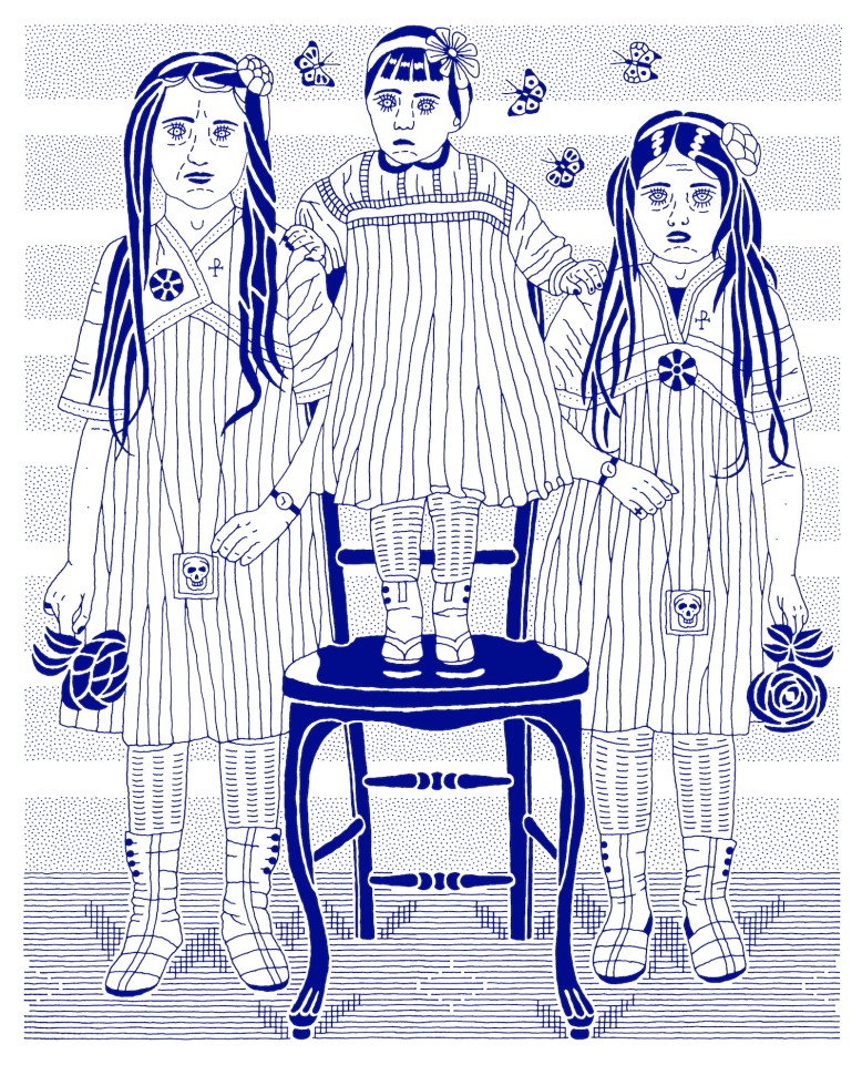
IMG_4965.JPG

WILLIAM HIGGINS is a writer and photographer. His work has been published by several magazines, including Glass Kite Anthology and Textploit. He previously attended the College of Creative Studies at the University of California, Santa Barbara, studying creative writing and literature. In the fall he will start at University College Dublin to study law and philosophy.

Annie and Her Two Sons

Artist Statement: Painting is a cross between a crap shoot, finding your way out of the woods, and performing a magic act. Each time I begin to paint I feel like I am walking a tightrope—sometimes scary, sometimes exciting, sometimes very quiet, and always, always surprising;
leading me where I never expected to go. Doing art makes me lose all sense of time and place and go inside one long moment of creating.


Whenever I feel a painting in my gut, I know this is why I paint. The colors are the message, I feel them before my mind has a chance to get involved. Color is the most agile and dynamic medium to create joy. And if you can find joy in your art, then you’ve found something worth holding on to.


forrest_annie_and_her_two_sons_oil_on_canvas_panel_2014.jpg

Watercolour on Paper, 12″ X 9″, 2016


ALLEN FORREST has created cover art and illustrations for literary publications and books, the winner of the Leslie Jacoby Honor for Art at San Jose State University’s Reed Magazine and his Bel Red painting series is part of the Bellevue College Foundation’s permanent art collection. Forrest’s expressive drawing and painting style is a mix of avant-garde expressionism and post-Impressionist elements, creating emotion on canvas.

Self-Conscious

Artist Statement: The girl who inspired “Self-Conscious” was a stranger who looked away when I smiled, who hid her face as I walked by. Later, I asked my sister to recreate the pose and tried, I think, to paint the aching of us all.


Self Conscious.JPG

Watercolor and Charcoal on Paper, 18″ X 24″, 2014


KATHRYN SPRATT lives in Centerville Utah, where she spends her days at a junior high, teasing genius from younger minds. She prefers to greet the evenings with a paintbrush in her hand.

Two Pieces

Artist Statement: My pictures in Inklette belong to a series. “Exiled from Truth: Nine Allegories by Dmitry Borshch” is the title under which some allegorical pictures are collected, possibly more than nine: the series continues to develop. They are united by color, style, and technique, so I view them as a homogeneous collection of drawings. Allegory, drawn or written, is a product of that mind which regards truth as existing-in-absence: it does exist yet is absent from our view. Allegories like mine would not be needed if truth were openly present.


budding_patriarch

‘Budding Patriarch,’ Ink on Paper, 33″ X 33″, 2009


daughters_of_the_dust

‘Daughters of the Dust,’ Ink on Paper, 26″ X 21″, 2010


DMITRY BORSHCH was born in Dnepropetrovsk, studied in Moscow, and lives in New York. His drawings and sculptures have been exhibited at the National Arts Club (New York), Brecht Forum (New York), ISE Cultural Foundation (New York), the State Russian Museum (Saint Petersburg).